NAL
Campaign - A raw visual universe
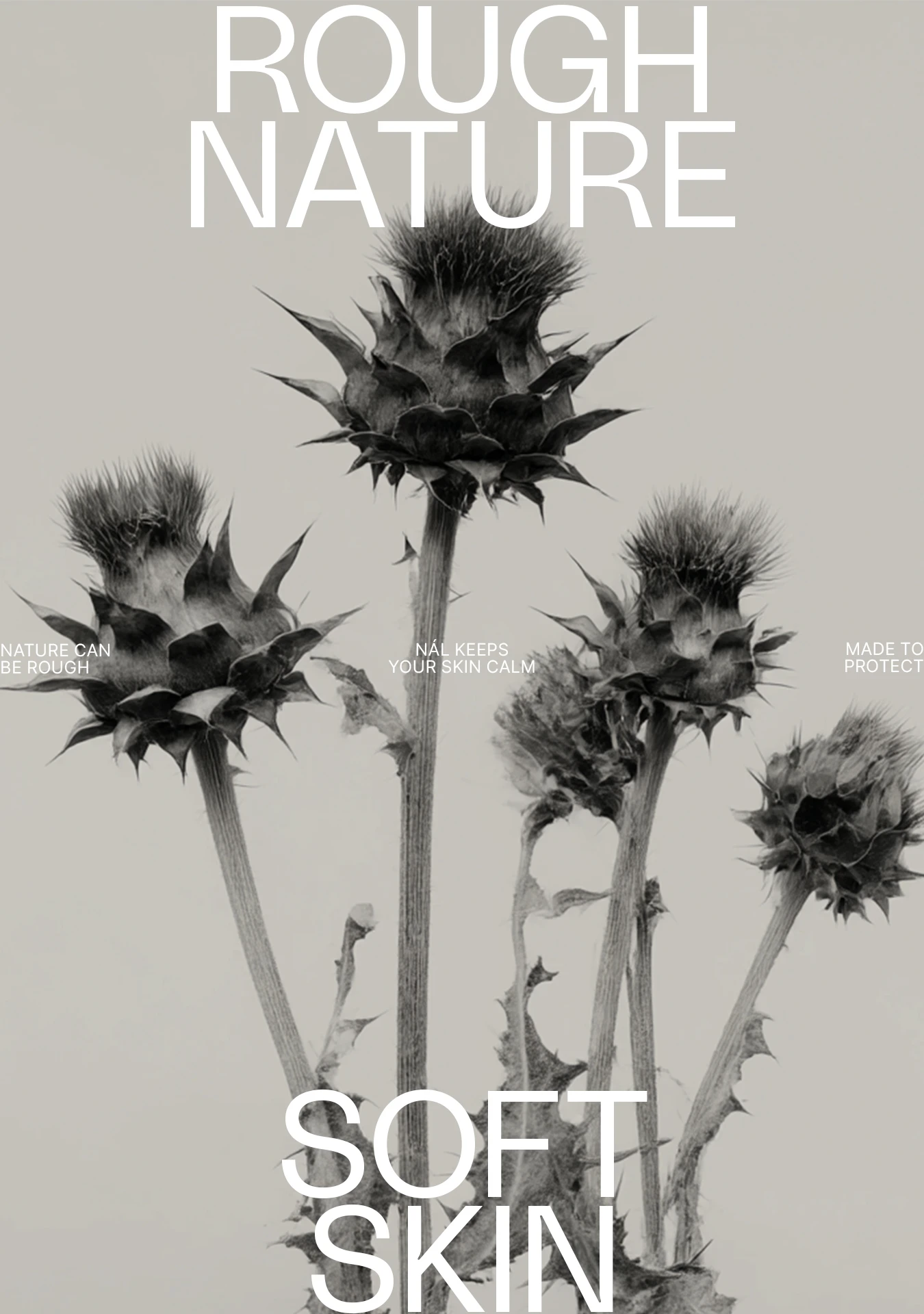
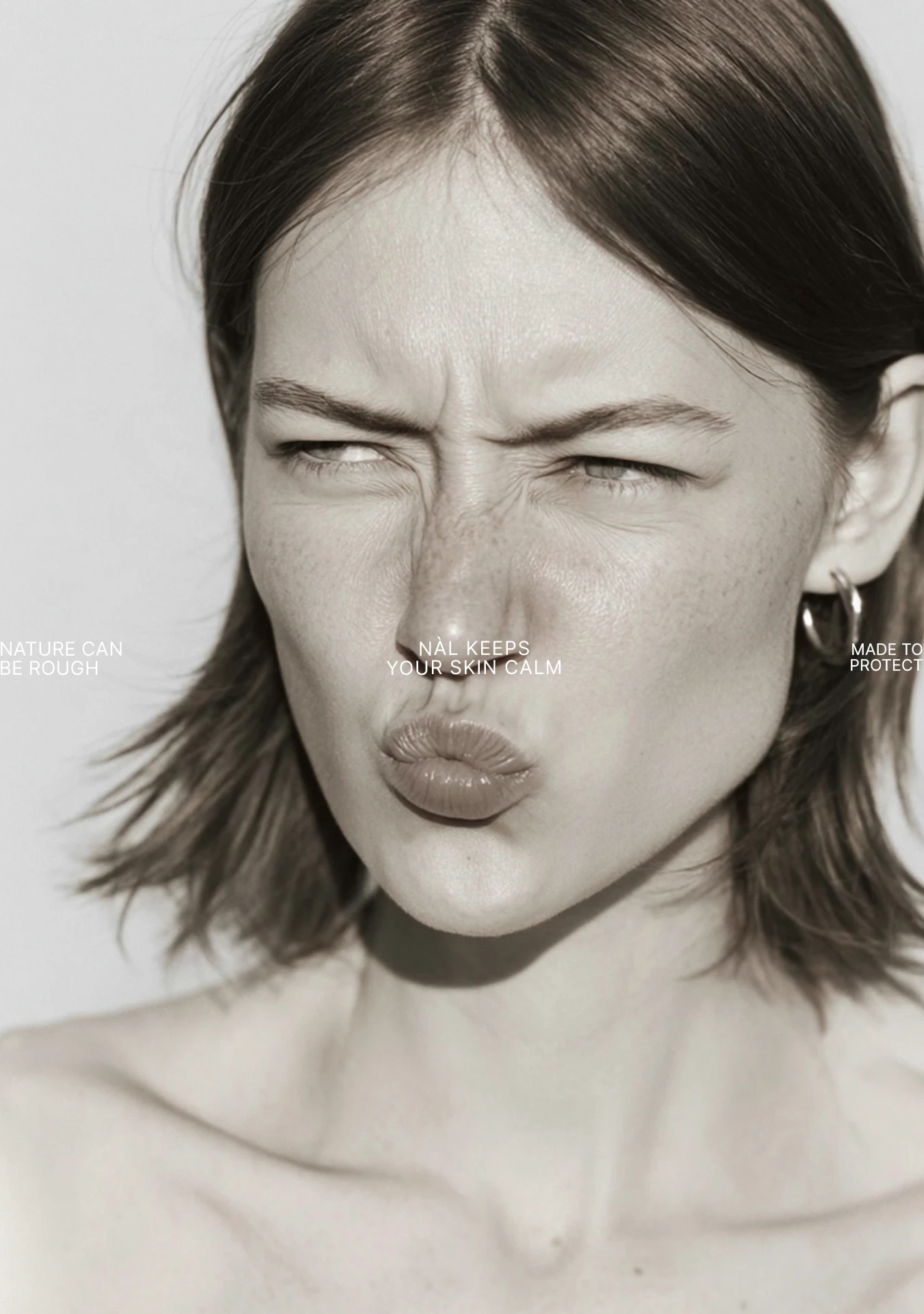
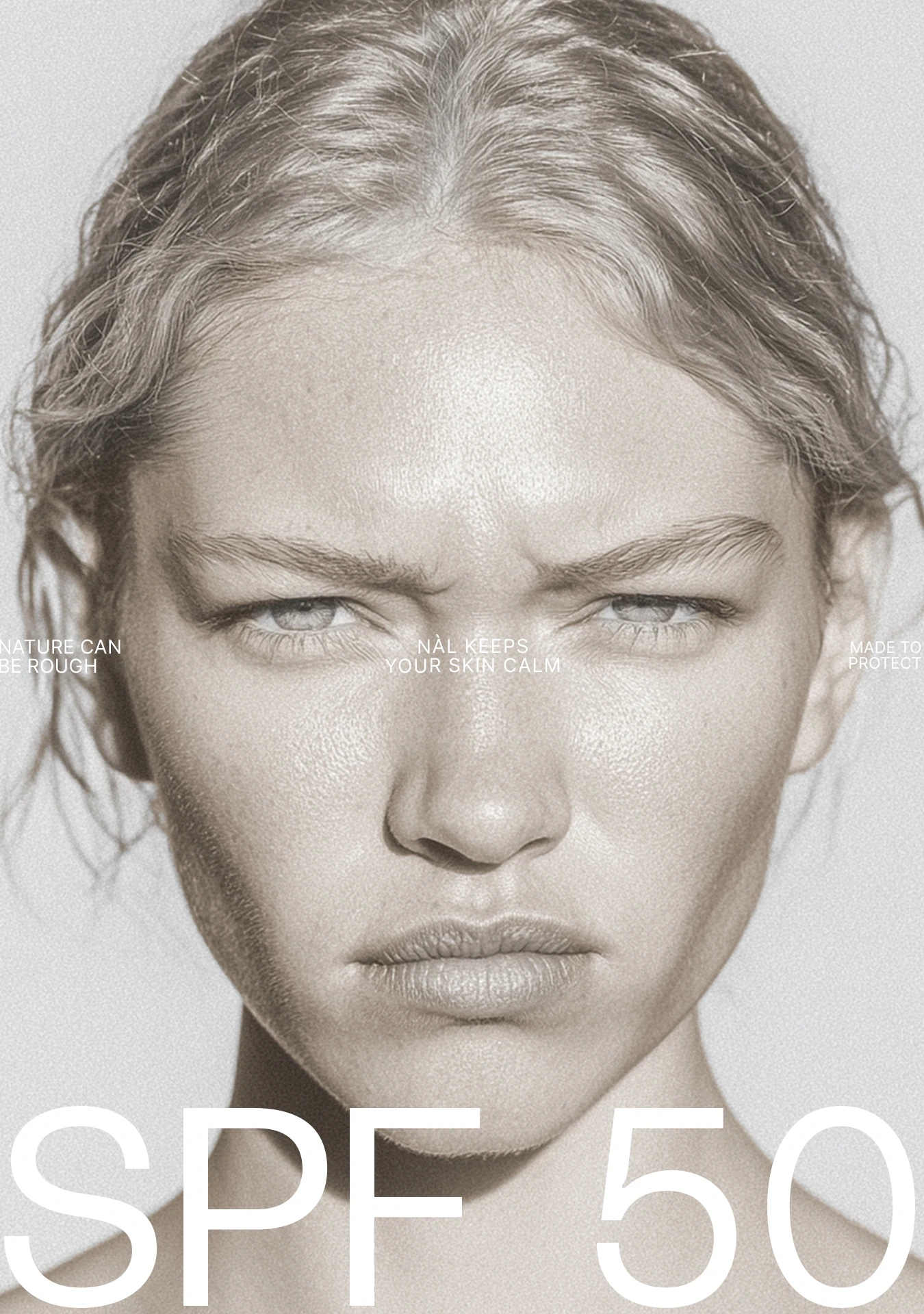
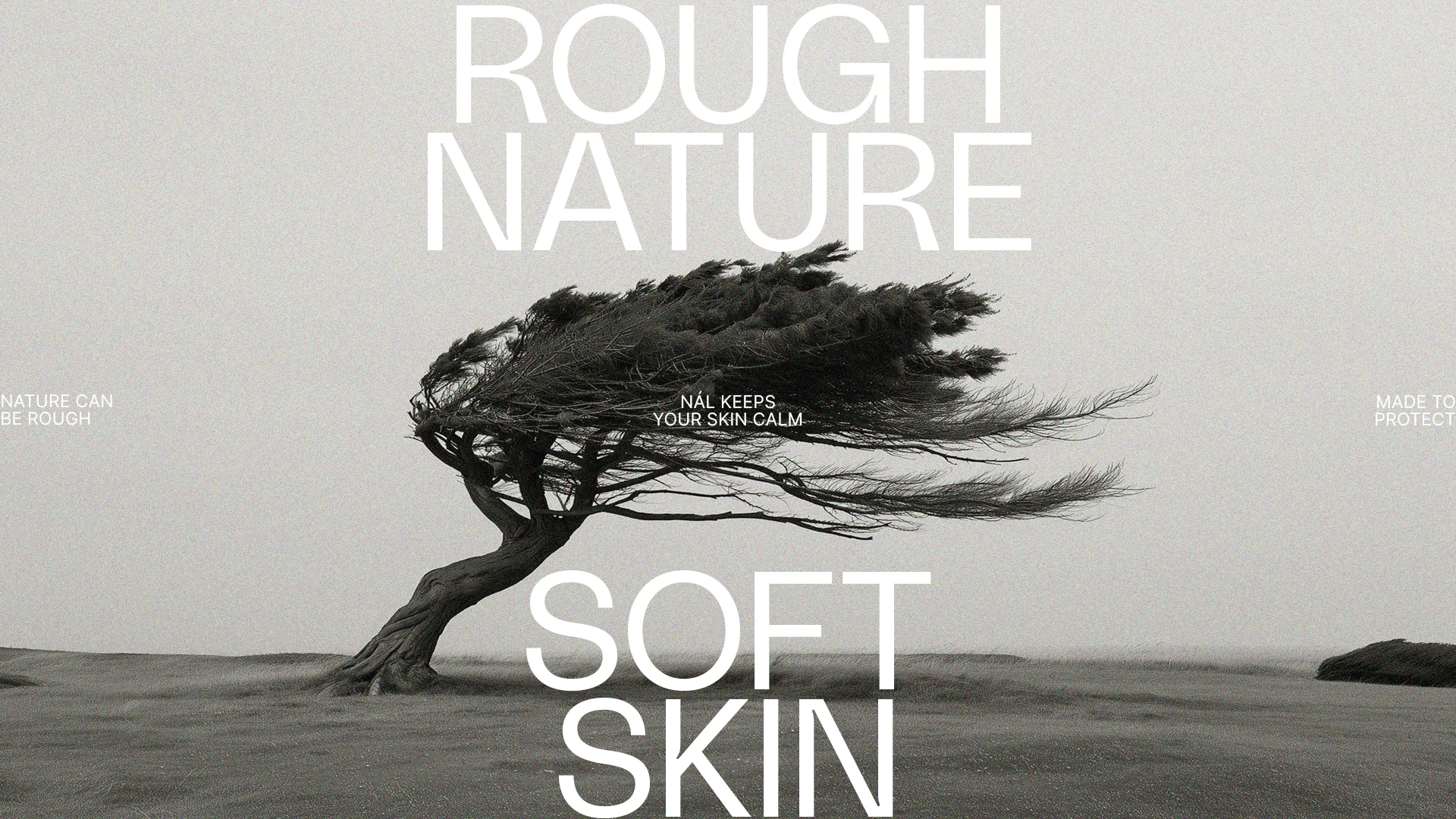
For a skincare line rooted in Nordic ingredients, we created an identity inspired by nature at its most raw and uncompromising. The concept Rough nature, soft skin places the contrast between harshness and protection at the centre, shaping a visual universe with a distinct edge.
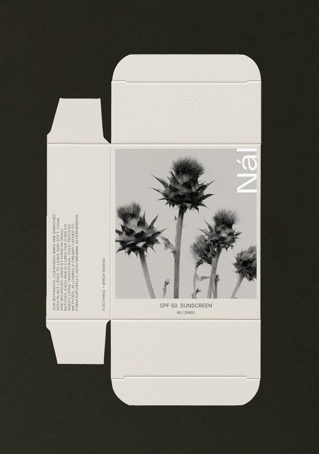
Monochrome imagery, tight crops and bold typography give the identity a direct, almost editorial expression. Nature appears windswept, thorny and unpolished, while the restrained packaging creates a sense of contrast. The result is a skincare brand that brings together natural ingredients and function with a raw visual attitude.